Art Directors : Edison Yan (Seasons 1-3), Kory Heinzen (Season 1).

Matte Painting and Backgrounds
My official title on this show was BG Painter, making my primary responsibility environments or sets. One of the most enjoyable parts of the job was to paint dramatic establishing shots of locations for the first time we see them. Often these locations only exist in 3d form as an interior, and the matte painting is the only time we see them from the outside, yet that is enough to sell them as a real place.


Characters
When there were no BGs to be done, or I was waiting on client approvals, I would work on whatever was most urgent to help the team out.
Guillermo Ramirez was our fantastic character designer on this show. He pumped out a tonne of quality designs really rapidly, and I had the pleasure of painting up the colour pass of a couple of his pirates!

Character design by Guillermo Ramírez Calvo. Colour by Matty. Art direction by Edison Yan.
This guy was a lot of fun to paint! Initially I presented some more varied colour schemes for his outfit but the director liked this unified look.

Character design by Guillermo Ramírez Calvo. Colour by Matty. Art direction by Edison Yan.
I believe Edison painted directly into this guys face near the end to really up the sun aged leather look.

This character, known as the “Princess Monster” was a lot of fun to work on. The concept was borrowed from the angler fish, but with a twist. It’s organic lure is in the shape of a distressed princess, to lure in adventuring heroes. Except the princess is a slimy, translucent blob. This character was already designed by Dreamworks TV in LA when I first saw it. My task was to do the colour pass and add detail, as the existing design didn’t really communicate the scale of the creature well.
Set colours
Quite separate from matte paintings are the actual 3d sets. For the Adventures of Puss in Boots, these would be designed by Olga Stern and then handed off to another artist for colour passes.
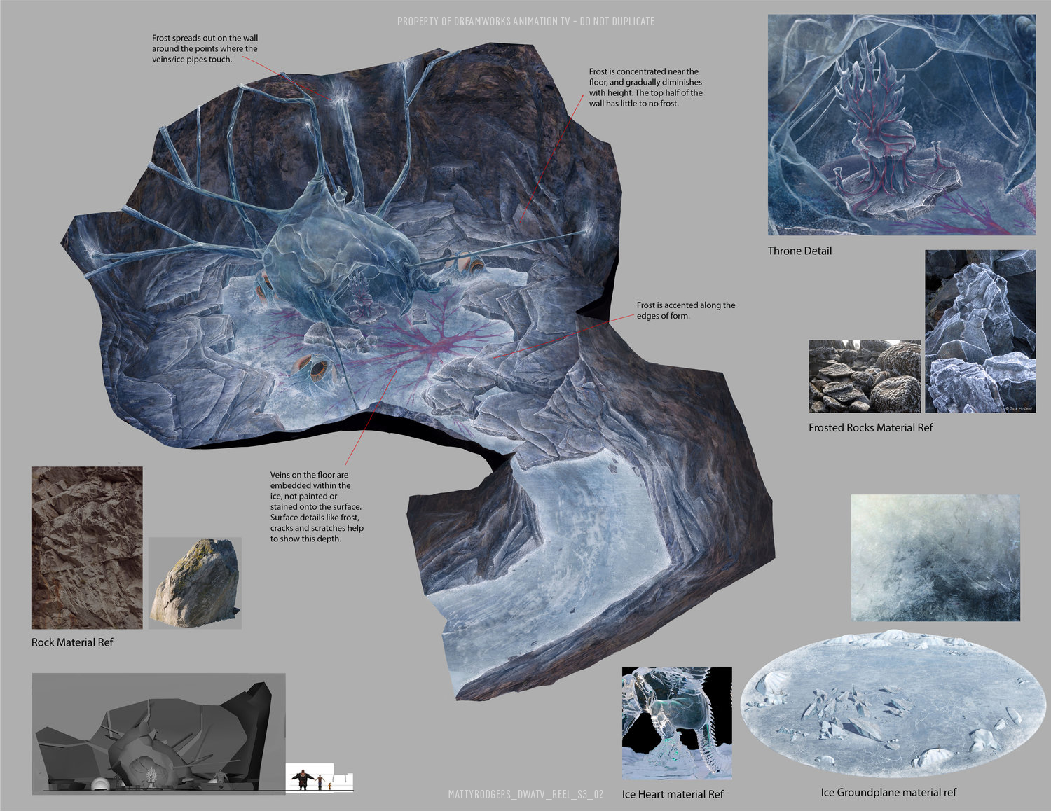
When creating a matte painting you can use lighting and interesting camera angles to create a good composition. Set colours are more about communicating clear information to the surfacing team. Texture artists prefer to see a set painted with neutral diffuse lighting to better understand the local colours and materials. The set colour works best from a three quarter angle, with litte perpective. Notice there is a closeup detail of the throne, reference photos and little notes to call attention to, and better explain design decisions.
Set design by Olga Stern. Colour by Matthew Rodgers

Set design by Olga Stern.
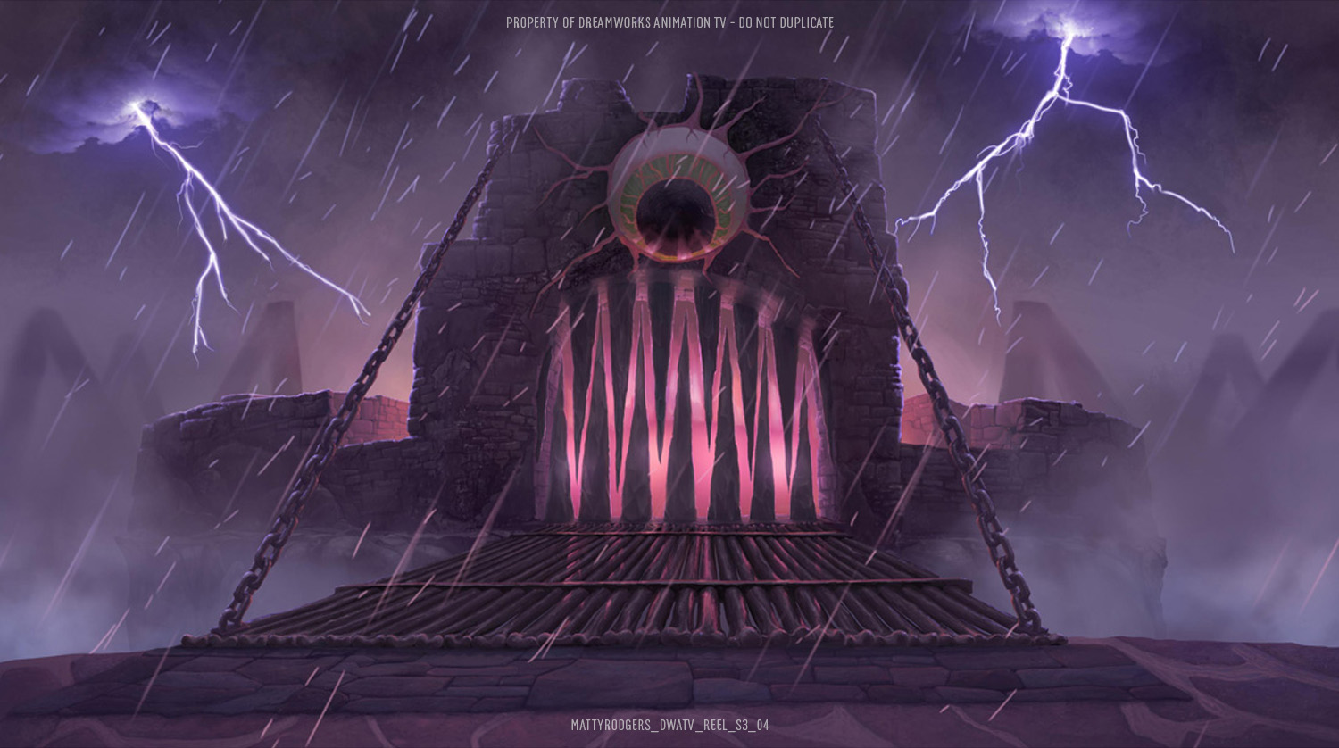
While the diffuse colour pass was enough for some sets, other sets had very unique lighting which required a painting to showcase it. The set below just didn’t feel the same with diffuse neutral lighting. The unusual magenta torches and purple lightning really help to create the otherworldly feel of this set. Because the set lighting is all about storytelling, and how the set actually appears in the show, the lit pass was usually done from down at the characters POV.
Set design by Olga Stern.
Prop Design
Props are the simplest and most abundant assets created for an animated show. There are always more props that need designing if you have a spare day in your schedule. I always found them an enjoyable change of pace and subject matter from all the environment work. Here are some of the memorable ones.


The Dust Devil in season one falls somewhere between a prop and a character. Initially the brief was to make it as simple as possible with textured cards. I was not a fan of this approach and tried to make the limitations of that approach clear in the design colour pass. Somebody higher up clearly agreed with me as the final version in the show was done the hard way with a fully simulated particle cloud and, and it looks fantastic!
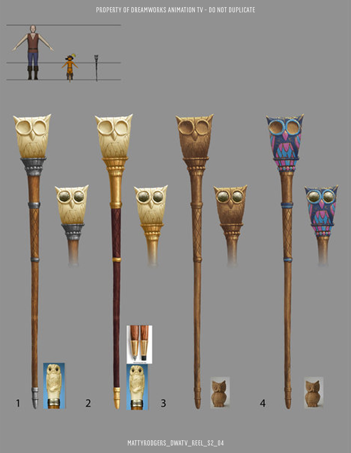
This owl staff was designed by Jake Collinge. I had a lot of fun playing with materials on the colour pass. This is a good example of how handing off the colour pass to an artist other than the one who designed the prop can bring fresh ideas to the asset. Normally three options would be enough for such a simple asset, but I was enjoying myself on this one.
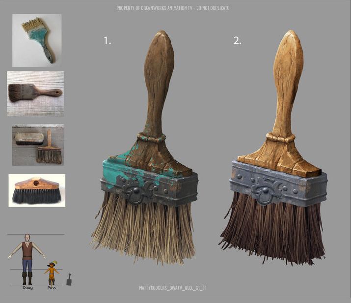
This simple paintbrush garnered a lot more attention than it deserved. Our art director, Edison Yan, had printed out enough art to line the walls of our office, and this brush was among them. Whenever VIP guests and investors would come by to meet us and see the project, Barry Ward (Co-founder of Bardel) would point this simple prop out and say “look at how much love they even give a humble paintbrush!”. He was very proud of the work we were doing on Puss in Boots at the time and for some reason the finish on this unimportant prop served as a symbol for how hard out team was working. While I never considered this paintbrush my career highpoint, pleased and amused by the attention it got.
CYcolramas and skydomes
Animated TV is always a bit of a compromise. Nothing comes for free in animation, you have to create every last bit of it, including skies and distant hills that most people will never look twice at. On a TV budget and timeline the sets tend to be very limited in the size. When the set is an exterior, this means that you can see the edge of if in every shot, and the only cost effective solution is to use painted elements to extend the set and hide it’s edges.
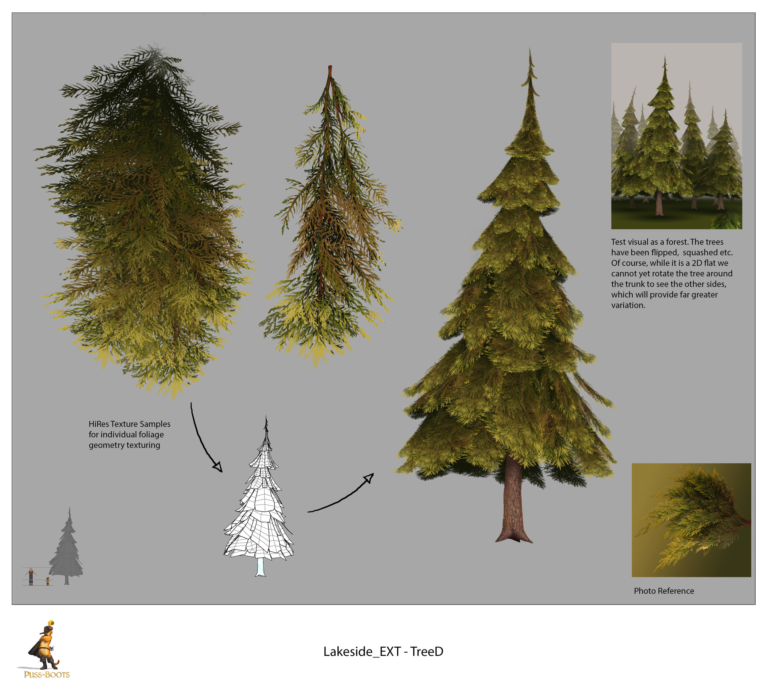
It is common in animated shows for the set to have a layered painting of the distant landscape set on a cylinder all the way around the set. These paintings are known as cycloramas. Behind them is usually a large dome or box with a painted sky on it. Being the BG Painter of the show, these elements were all my responisibility.
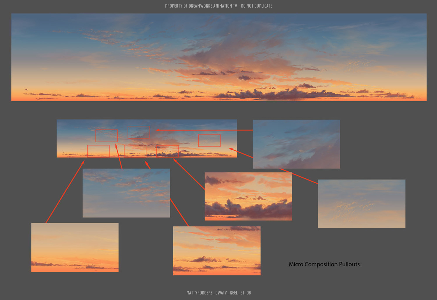
The big challenge of cycloramas and skydomes is how large they are. They need to look interesting when in the background of a huge variety of shots, which will only show a tiny portion of the sky. This can be very time consuming to create but there’s always a schedule you need to meet.
You may notice that there is no directional light in this sky. The sun seems to be setting in all directions at the same time. This was the way the lights were setup on Puss in Boots. It was a cost cutting measure that meant the scenes could be lit with a generic lighting a lot of the time.

Cycloramas are almost like a set extension. Painted in layers to create some parralax, they need to be painted to sit right behind the edge of the set, and give the illusion that it continues into the distance. Each set would need the cyc repainted for each time of day. These are just two examples to show the style
