The Dragon Prince
Working on The Dragon Prince was a real journey for me. I started with development, creating pitch images to sell the show and land the job. Then I was Lead BG artist. I was still designing sets and painting mattes, while supervising other BG artists. I would provide block-ins or paint overs for them. By Season 3 the original art director, Edison Yan, had moved on and I jointly took over his role. It was my first time supervising a full show and following all kinds of designs right through the pipeline. What a fantastic show to do it on. Challenging, but very very rewarding.
My very own dragon princess was born part way through season 1 :) Truly a memorable journey.
Our whole team is so proud of what we made, and we are so happy to see the fans embrace it as they have!
We are currently working on season four and there is a lot more epicness coming your way, so stay tuned.
Matte Paintings
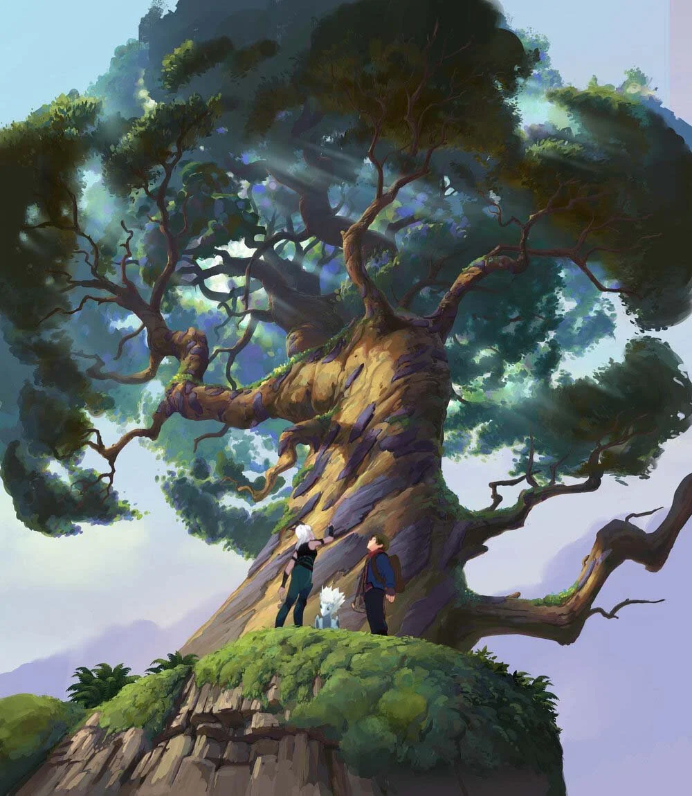
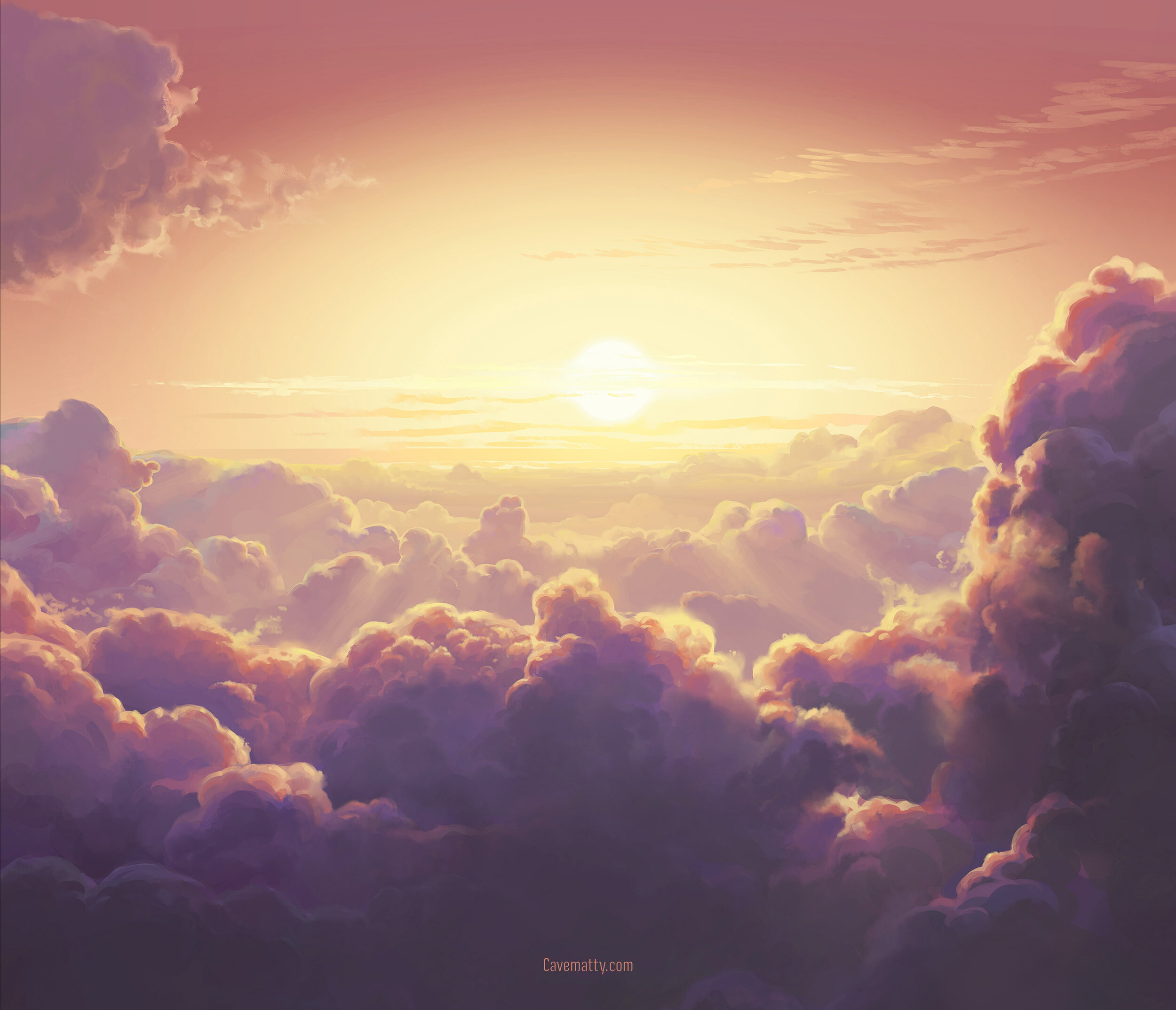
The rich, painted backgrounds are one of the big draw cards of the show. Our take on a hand painted, Ghibli inspired aesthetic. These are couple of my favourites that I took all the way through. There were so many, and many more that I supervised or collaborated on with the team.
Development
These were the first pieces I painted for the show. They were turned around really fast to try and establish the BG art style, but also to do so under realistic TV productions schedules. I was really happy with them given the constraints, and so were Wonderstorm. The Katolis castle remained true to this initial paint throughout, and the second painting ended up being the starting point for the moon dorms at the end of Season 1
Set Designs
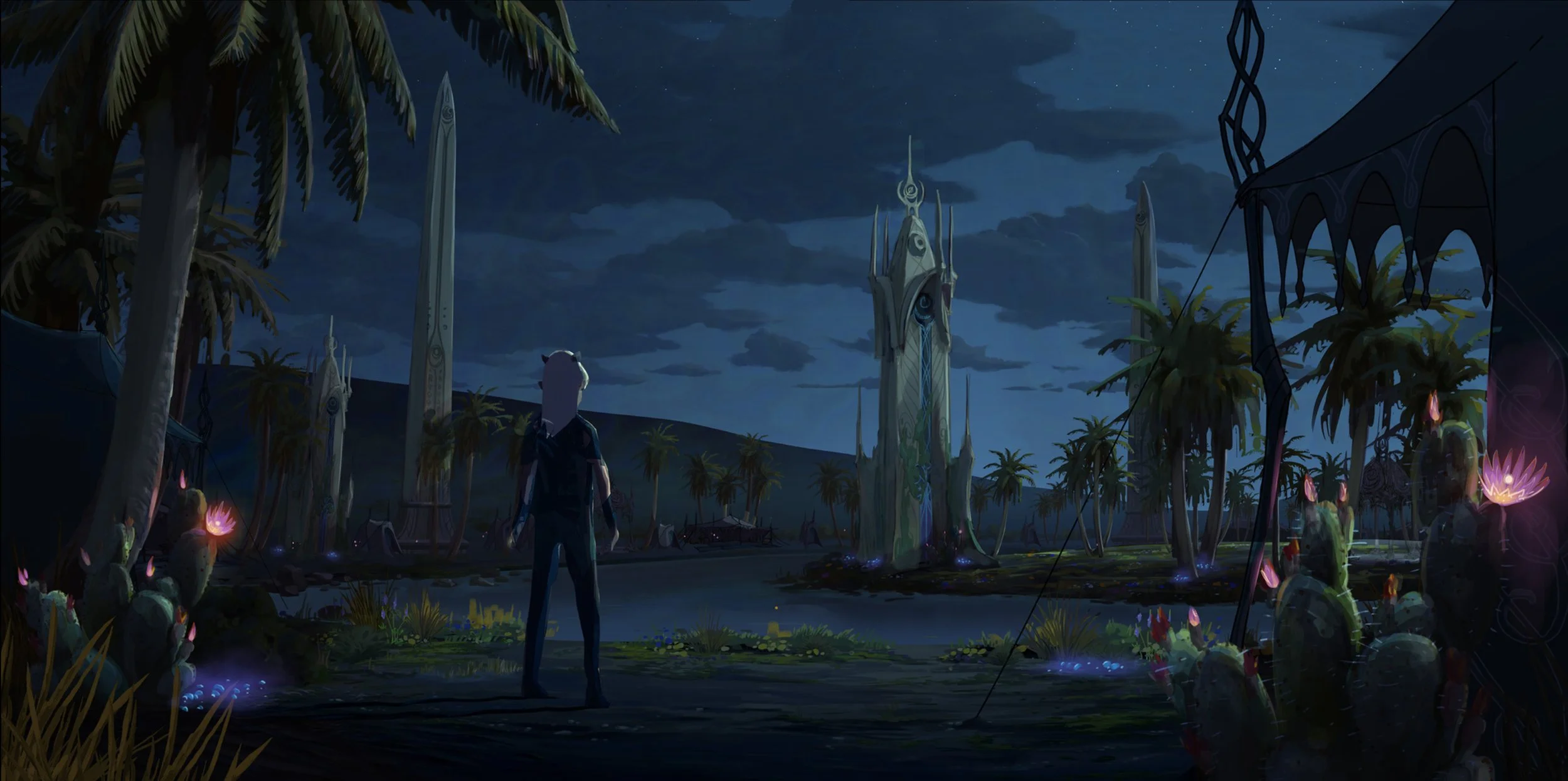
The Xadian midnight desert oasis.
Set design was an interesting challenge on this show. It's a travelling show, so every episode has many new environments, yet we were on a TV budget so we had to stretch out every cent and get it up on the screen. We were often designing sets, like the oasis above, with this in mind. Planning out some parts to be painted set extensions or cards, so that we could get the epic scope the story called for without breaking the bank. It required clever design choices, and lots of custom pipeline solutions for individual sets or shots. But we got it done!
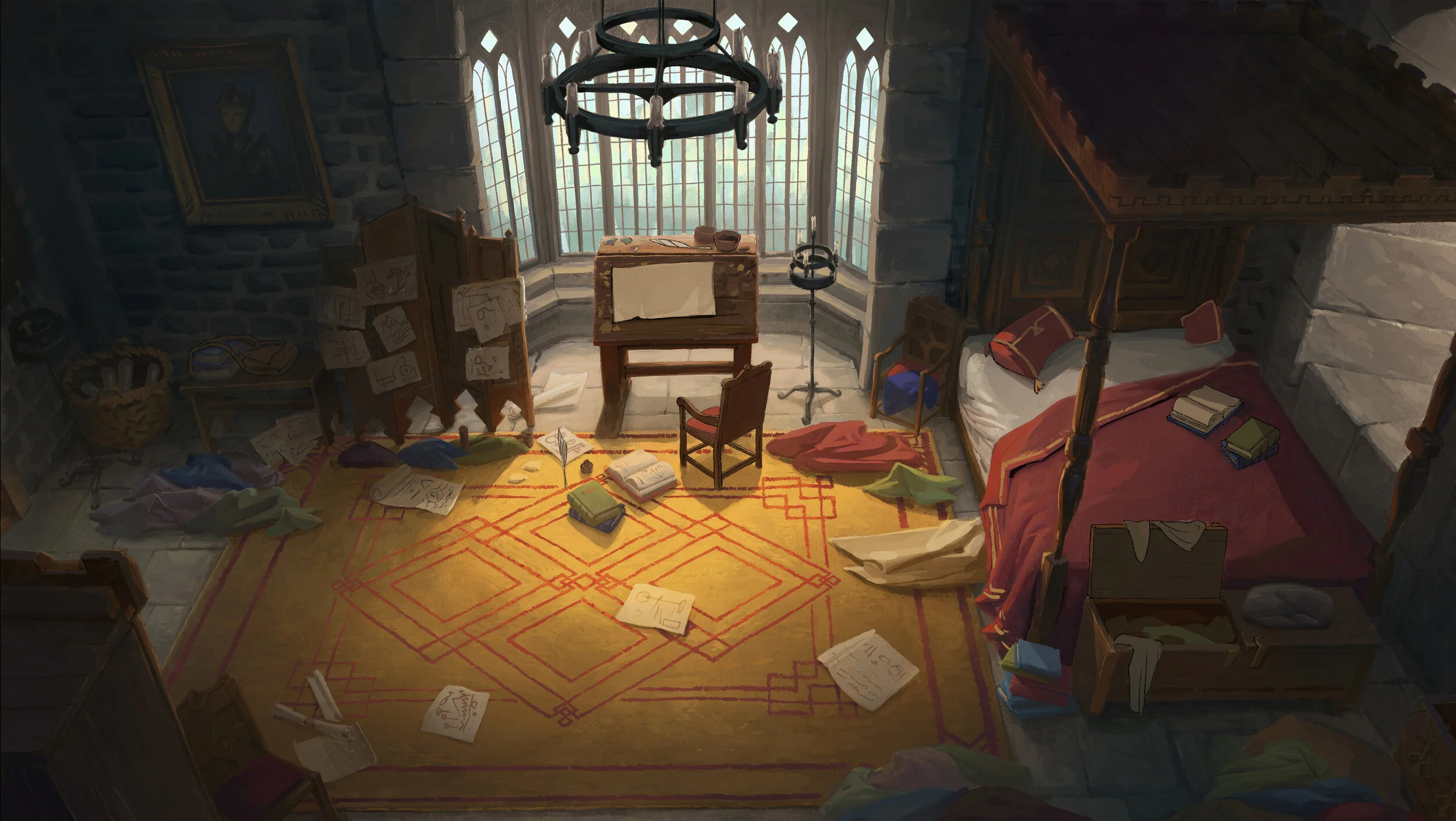
The first set I design for the show was Prince Callum’s bedroom. He’s and arty type, with drawings everywhere. Also he’s a bit messy!
Initially we weren’t sure whether this would be a 3D build, painted shots, or some combination of the two. The shots ended up all being painted, mostly by the stupidly good Michael Macrae.
Ezran’s bedroom is messy too. Instead of drawings everywhere he has lots of little trinkets and things he has ‘collected’ while exploring the castle with his best buddy Bait. He actually knows the castle better than almost anybody, and all that exploring might lead him into some interesting places in the future… There’s a strong theme of primary colours in the two bedrooms, to help sell the idea of it being a kid’s room despite the grey stone walls, and the lack of obvious icons of kiddi-ness. No soccer balls, or teddy bears or toy trains. But hopefully it still reads as a child’s room immediately.
Thanks to my AD, Edison Yan, who enhanced the lighting on the window and rug at the last moment which really helped the piece.
Design for the dark magic chamber entrance.
Design for the dark magic chamber
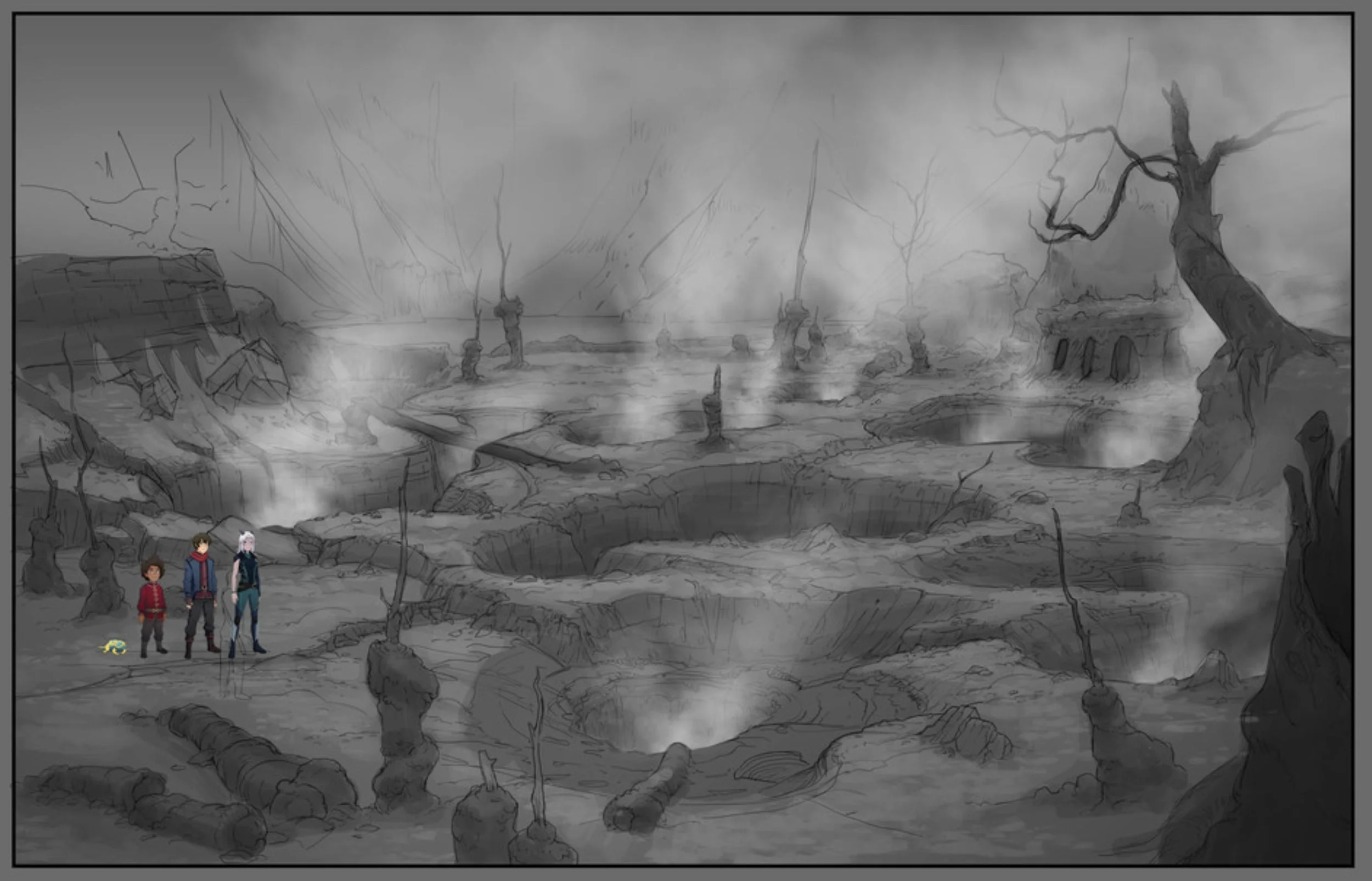
Design for the swamp on the cursed caldera.
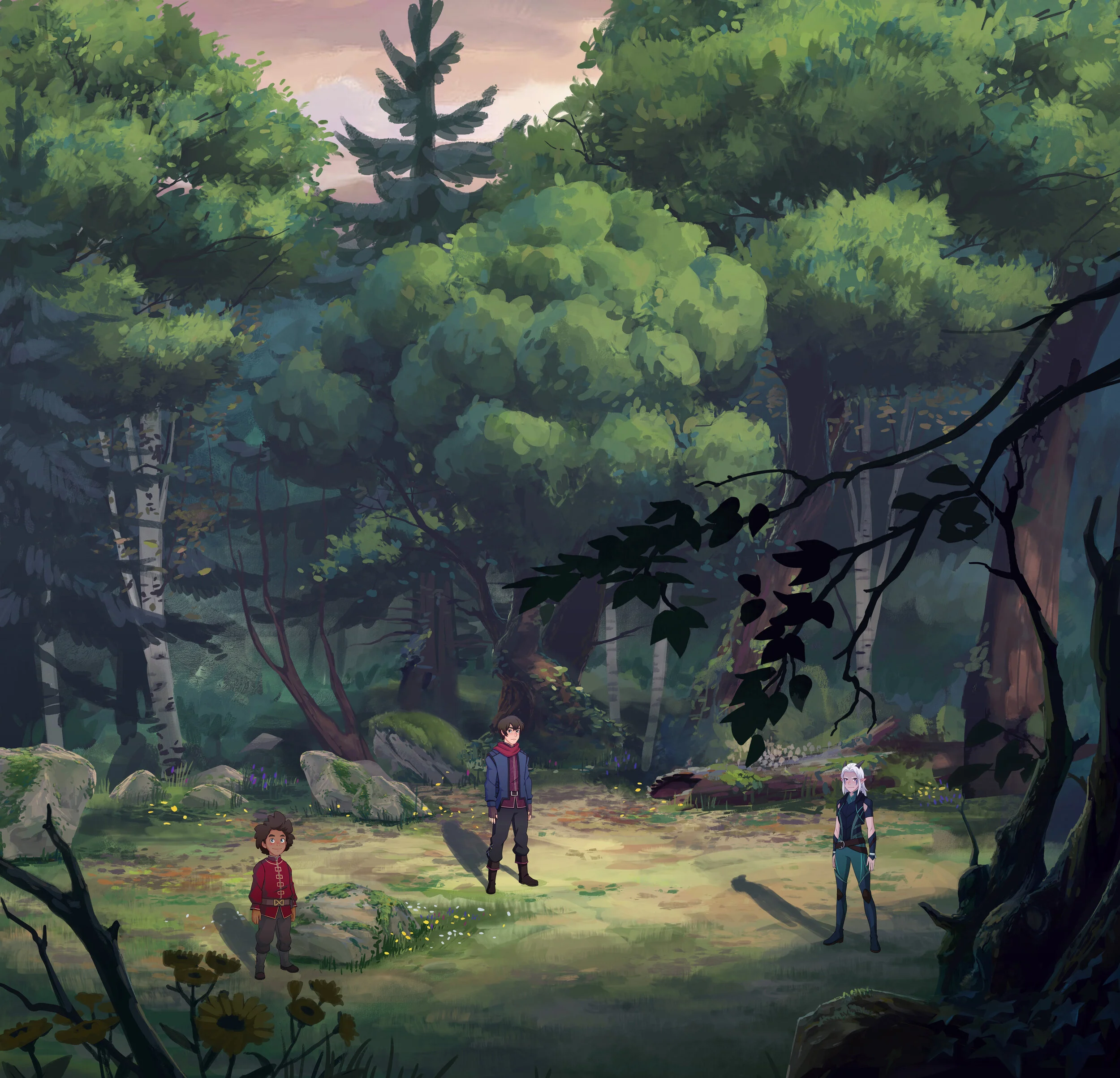
This clearing was the second forest set I designed. Many of the assets we created for this set appeared in almost every episode of the show. Maybe TreeBirchA should be getting residuals?
Colour Keys
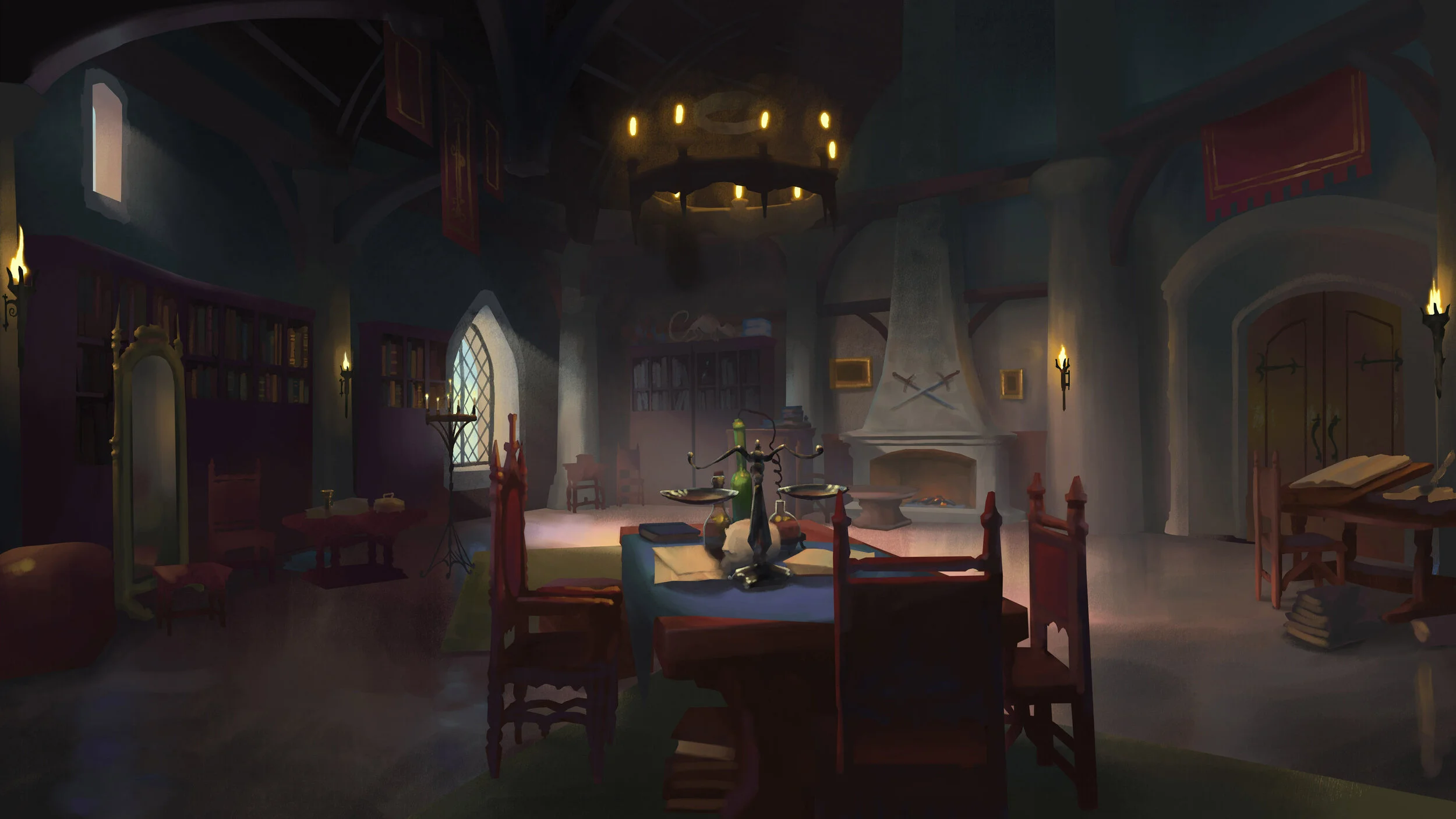
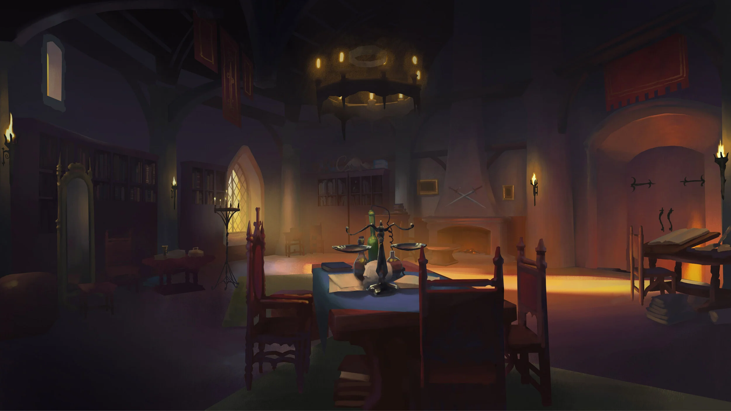
Viren’s study was a key set we revisited many times in multiple episodes. I created these colour passes to explore local colours and to see how to light the set at various times of day. The passage of time is quite important in the show, and we tracked time of day, light direction and even the time of the month. This was because the moon is. a major source of magic in the world, and it’s phase affects the capabilities of some key characters.
Fan art
The Dragon Prince was really embraced by the fans, and there is a whole community of creators who set about making fan art of the show and it’s characters. Above is my ‘May the 4th’ rendition of Callum.
Below are the mockups I made of our characters as Funko Pops. Happily several of these were made real, and grace my desk to this day.
